Description
Alerts are attention-grabbing components used to convey important messages or notifications to website visitors.
Guidance on usage
When to use the alert component:
- System status messages. An alert may be a notification that keeps people informed of the status of the system and may or may not require the user to respond. Such notifications may be errors, warnings, and general updates.
- Validation messages. An alert may be a validation message that informs a user they just took an action that needs to be corrected or a confirmation that a task was completed successfully.
When to consider something else
- Long forms. On long forms, always include in-line validation in addition to any error messages that appear at the top of the form.
- Destructive actions. If an action will result in destroying a user’s work (for example, deleting an application) use a more intrusive pattern, such as a confirmation modal dialogue, to allow the user to confirm that this action is what they want.
Usability guidance
- Consider next steps. When the user is required to do something in response to an alert, let them know what they need to do, and make that task as easy as possible. Think about how much context to provide with your message. For example, a notification of a system change may require more contextual information than a validation message. Write the message in concise, human-readable language; avoid jargon and computer code.
- Be polite. Be polite in error messages — don’t blame the user.
- Alerts are an opportunity. Users will read a message that helps them resolve an error even if they generally won’t read documentation; include some educational material in your error message.
- Don’t overdo it. Too many notifications will either overwhelm or annoy the user and are likely to be ignored.
- Allow a user to dismiss a notification wherever appropriate.
- Understand the user’s context. Don’t include notifications that aren’t related to the user’s current goal.
Adding and Managing Alerts
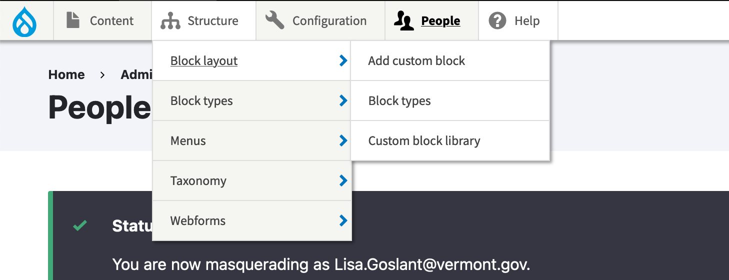
- Navigate to Structure -> Block Layout
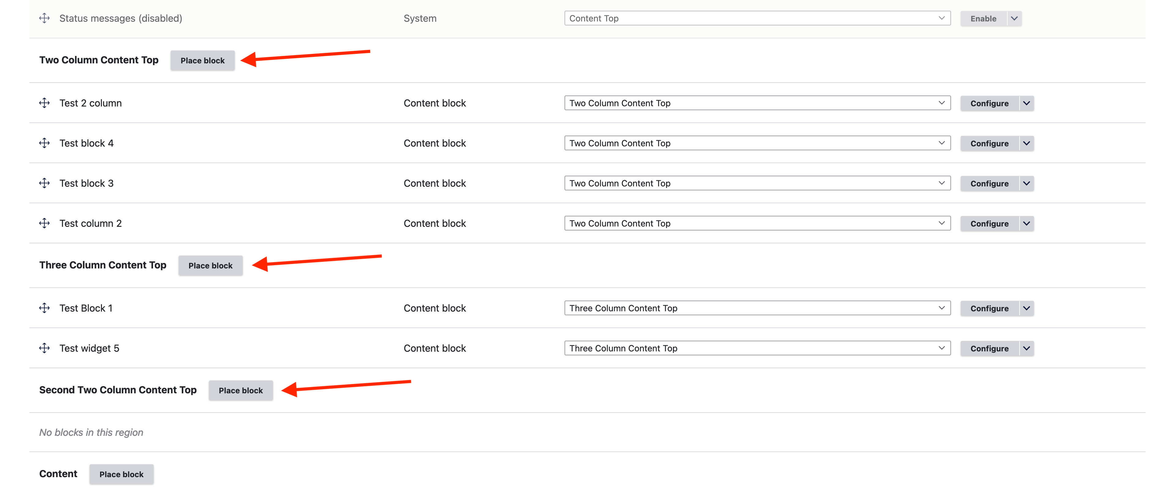
- Select the “Place block” button in the region you would like your widget.
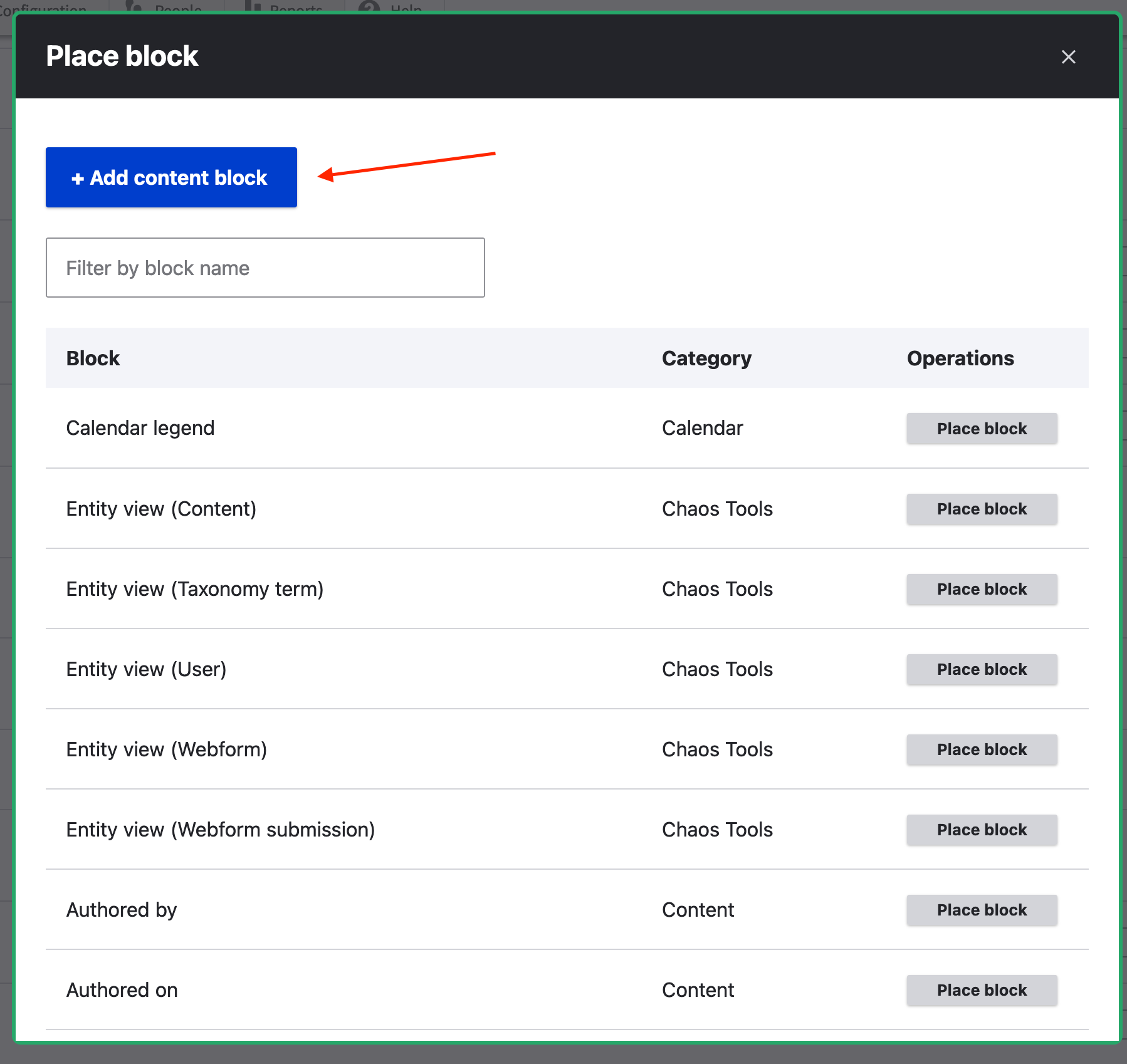
- Select the “Add Custom Block”
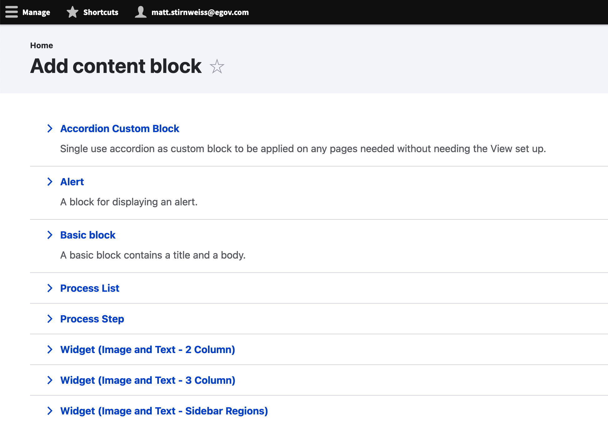
- Select “Alert”
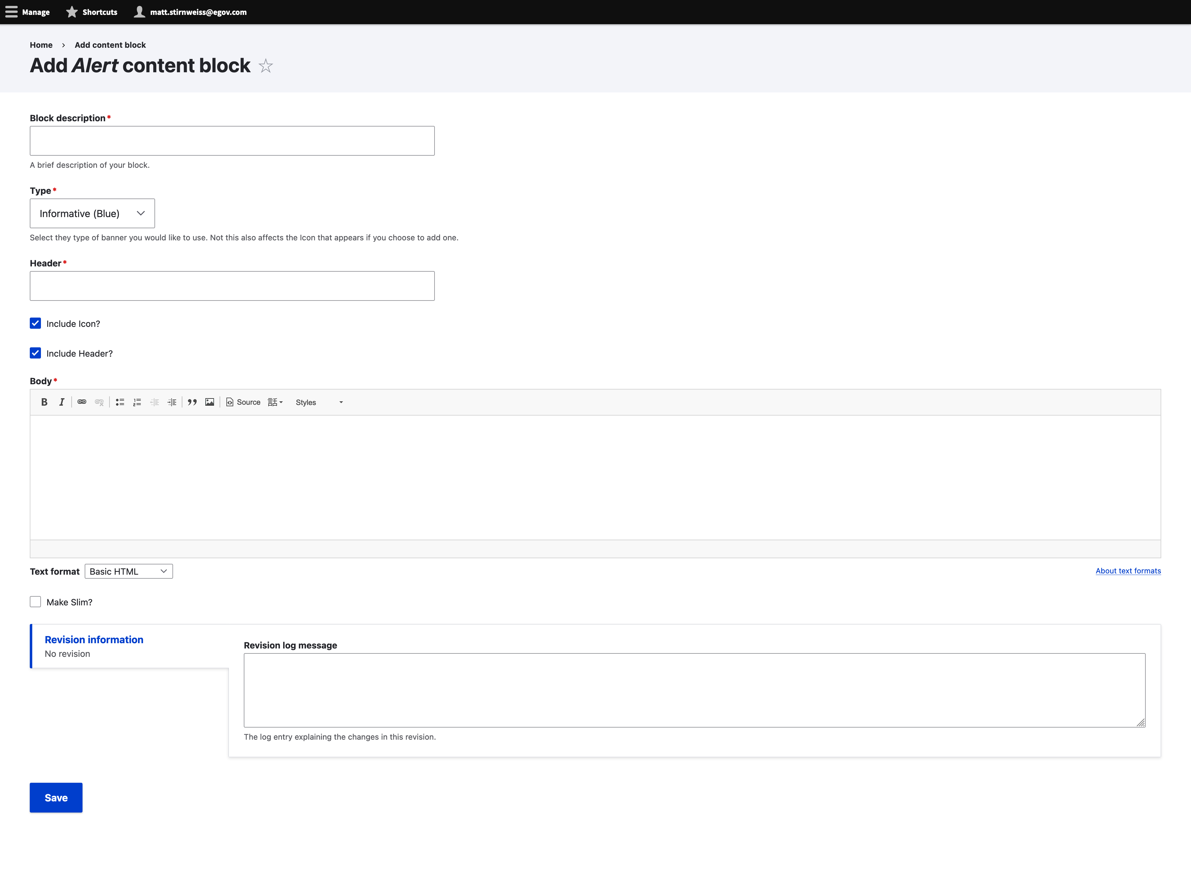
- Fill out the following fields:
- Block Description: Description used in the administration panel
- Type: The type of alert it should be. There are five options:
- Informative (Blue)
- Warning (Yellow)
- Error (Red)
- Site Alert (Deep Red)
- Success (Green)
- Header: Bold text displayed next to the icon (if present)
- Include Icon?: Un-check to remove the icon.
- Include header?: Un-check to remove the header.
- Make Slim?: Check to make slim (Recommended to remove header with this or leave body empty)
- Body: Text below the header.
- Save
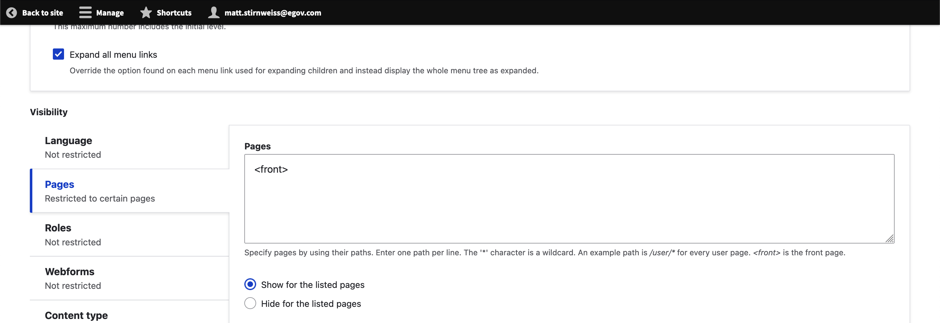
- Hide title and set the page restriction to the page or pages you would like it to display.
Customization and Styling
There are three customizations available:
- Removing the icon
- Removing the header
- Making it slim